If you want to use diagrams in a report which is based on nested datasets, you have to prepare the data manually. This will be exemplified in the following example.
The report should contain a list of all operating systems. In addition, a list with all clients running on the operating systems concerned should be created for each operating system. At the end of the report the distribution of the operating systems is to be represented graphically in a pie chart. However, before this can be done, the number of clients of an operating system has to be calculated manually.
First, create a new report (see Add Report). If the desired query exists already, it can be selected. Otherwise, you can create a custom query for the report. The example used here only needs the information "OS Name" and "Computer Name".
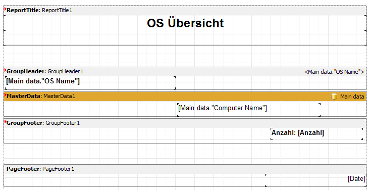
Then add a group header and group footer to your report. Enter the name of the operating system in the group header and create a corresponding field for the number of clients in the group footer. The required variable is created afterwards. If so desired, you can also add further information, e.g. the date.

Creating the Group Header and Group Footer
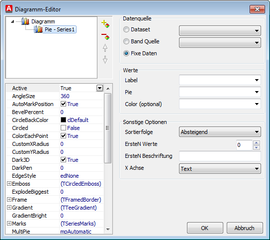
For the diagram, you can use the tape "Report Summary". It merely serves logical structuring and is not mandatory. Then insert the diagram. Make sure to enter "Fixed Data" as data source. If necessary, you can make further layout adjustments.

Insert Diagram
Now go to the code tab of the ReportEditor. You first have to define the required variables. A total of 4 different variables are needed:
| • | Anzahl: Contains the number of clients of an operating system |
| • | Anzahl_Gesamt: Contains the total number of clients |
| • | X_Chart: Contains the list of different operating systems |
| • | Y_Chart: Includes the list of the number of clients of the various operating systems |
The required source code for each section of the report can now be inserted into the corresponding OnBeforePrint procedures of each tape. First, initial values must be assigned to the variables. This is done in the segment ReportTitle or GroupHeader. Make sure to set the variable Anzahl in GroupHeader to the value 0. In this way, the correct number of clients of the operating system can be calculated. You can then - in MasterData - increase the Anzahl and the Anzahl_Gesamt by one each. In GroupFooter the data can now be merged into one list. The data are stored as a string and are separated by a ";" (example: "Windows 7;Windows XP;").
Finally, the data in ReportSummary can be assigned to the diagram.
Source code
//Define variables
var
Anzahl : int;
Anzahl_Gesamt : int;
X_Chart,Y_Chart : String;
//Define initial values
procedure ReportTitle1OnBeforePrint(Sender: TfrxComponent);
begin
Anzahl_Gesamt := 0;
X_Chart := '';
Y_Chart := '';
end;
//Reset counter to 0
procedure GroupHeader1OnBeforePrint(Sender: TfrxComponent);
Begin
Anzahl := 0;
end;
//Count clients
procedure MasterData1OnBeforePrint(Sender: TfrxComponent);
begin
Anzahl := 1 + Anzahl;
Anzahl_Gesamt := 1 + Anzahl_Gesamt;
end;
//Add to list of clients and the quantity
procedure GroupFooter1OnBeforePrint(Sender: TfrxComponent);
begin
X_Chart := X_Chart + Memo4.Value + ';' ;
Y_Chart := Y_Chart + IntToStr(Anzahl) + ';' ;
end;
//Transmit data to the diagram
procedure ReportSummary1OnBeforePrint(Sender: TfrxComponent);
begin
Chart2.SeriesData[0].XSource := X_Chart;
Chart2.SeriesData[0].YSource := Y_Chart;
end;
begin
end.
Note: |
If display errors occur in a diagram, they are often due to insufficient display space. In this case, try to hide not required labels, e.g. Pie -> Marks -> Visible = "False". Moreover, it can be useful to change the position to the legend in Diagram -> Alignment = "laBottom" or "laTop" |
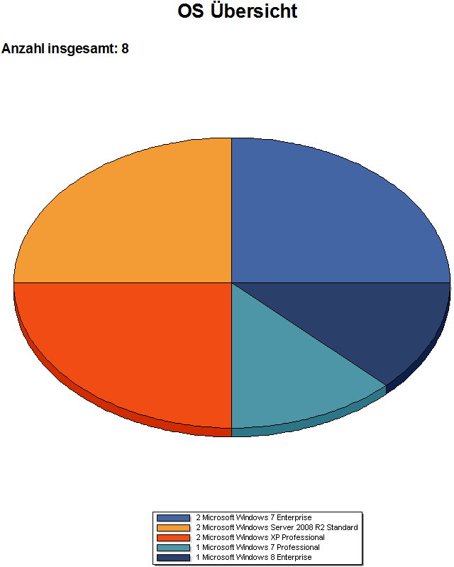
Sample diagram

Example: Pie chart
Last change on 10.03.2014